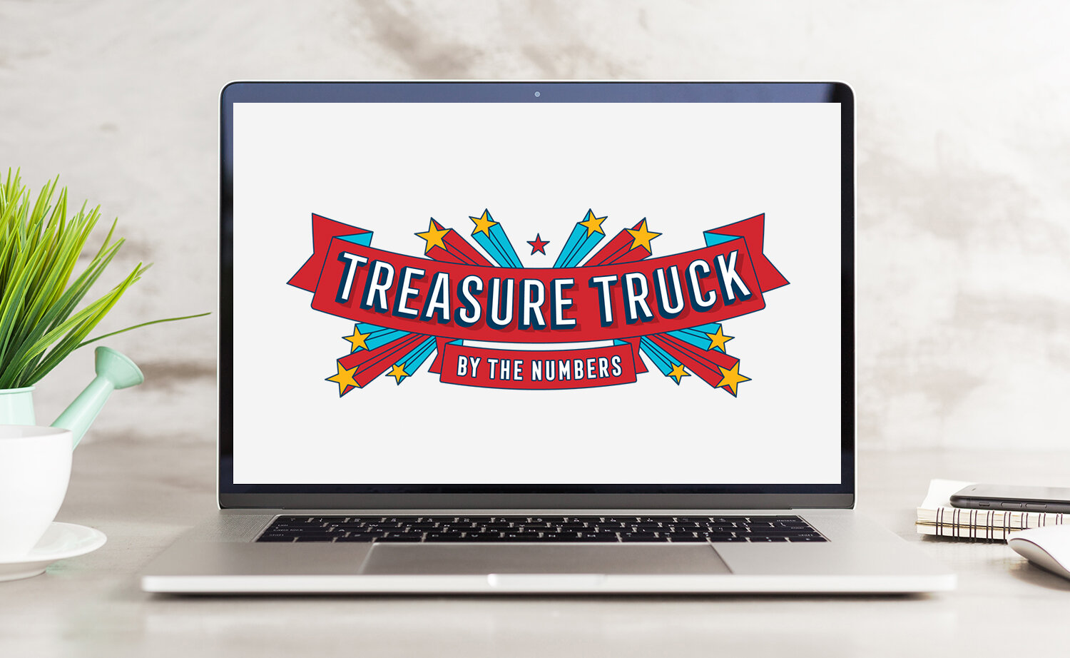
Amazon Treasure Truck
Project: Develop brand identity, voice, and visual aesthetic
Background: In 2016, Treasure Truck was developed in Seattle as an experimental Amazon product. Treasure Truck sold one must-have product per day that customers could purchase through the Amazon app, then make their way to a customized, carnival-like truck to pick up their purchase.
Process: As Treasure Truck prepared for nationwide and international expansions in 2017, my team was tasked with building out a robust brand identity, voice, and visual aesthetic that would scale with the product. Through team brainstorms and anecdotes from the Seattle test, we developed Treasure Truck’s guiding purpose: “To make an ordinary day a little bit special.” We used this purpose to build out brand voice pillars (“smart, friendly, and delightful”) as well as a visual style with notes of festive nostalgia.
Role: Art direction
Team:
Visual Designers: Tracey Ige & Travis Roof
Copywriters: Danica Rog & Jen Lyons
Amazon Treasure Truck
Project: Create an infographic for a business expansion press release
Process: In 2019, Treasure Truck expanded into five additional US cities. In preparation, Amazon PR requested that my team provide a list of compelling facts and figures to inform and accompany an expansion press release. I worked with the Copywriter, Designer, and Business Director to choose the most compelling data to construct into a modular master infographic that could be split up into smaller vignettes based on media outlet and story. The infographic was packaged and sent out with the press release, garnering 57 unique media placements.
Role: Creative direction
Team:
Visual Designer: Tracey Ige
Copywriter: Danica Rog
Amazon Treasure Truck
Project: Conceptualize and art direct a photo shoot featuring Treasure Truck's flagship truck
Process: In early 2017, Treasure Truck's flagship truck was redesigned and replicated into a 28-truck fleet for a nationwide launch. I planned and art directed a photoshoot to capture imagery of the newly minted truck to use across all launch communication.
Role: Creative direction
Amazon Treasure Truck
Project: Style guide for Treasure Truck’s holiday offers and experience
Process: In 2018, I led Treasure Truck holiday concept development by holding collaborative brainstorms with the Creative, Marketing, and Business teams, strategizing and documenting a plan, and defining a set of holiday creative deliverables. Based on that vision, I worked with a Designer and a Copywriter to create the holiday style guide, which the team used to create house ad campaigns, offer creative, swag, and the at-truck experience. Additionally, we developed a social campaign using stylized image templates, product poetry, and digital swag, which ran on Treasure Truck social channels throughout the holiday season.
Role: Art direction
Team:
Visual & Motion Designer: Jonathan Tipton-King
Copywriter: Danica Rog
Amazon Fresh
Project: Create imagery for both digital campaigns and large-scale installations at Amazon Fresh Pickup locations
Process: Amazon Fresh Pickup, an extension of Amazon Fresh grocery delivery, launched in 2017 as a convenient way for customers to order and pick up their groceries in 15 minutes or less. My team was tasked with creating a suite of imagery to inform, engage, and entice customers to use the service. I set the creative vision of showcasing fresh ingredients and home-cooked meals, plus a set of “how it works” images, then worked with the team to plan and execute multiple photoshoots. We used the resulting images to design for both large-scale and small-scale printed branding, as well as throughout the digital customer experience.
Role: Creative direction
Team:
Photo Art Directors: Zoe Lammer & Hannah Van Woert
Amazon Fresh
Project: Refresh Amazon Fresh branding
Process: In 2016, the Amazon Fresh business migrated from a standalone website onto the Amazon.com website. In preparation for the migration, I led a creative team tasked with refreshing the brand's overall look and feel to be cleaner and more cohesive. This refresh included a new Amazon Fresh logotype, custom photography, updated packaging, new brand collateral, and an updated digital merchandising style guide.
Role: Creative direction
Team:
Brand Designer: Hannah Van Woert
Photo Art Directors: Zoe Lammer & Elizabeth Mitchell
Visual Designer: Nicole Reiland
Amazon Fresh
Project: Build a scalable visual language for an Amazon Fresh single-item deals program that's instantly recognizable
Process: In order to develop a creative direction for this project, I gathered requirements for the single-item deals program from stakeholders. Based on the requirements, I set parameters for a custom photography style that would scale across multiple categories of product. The resulting visual system is product-focused with minimal propping, making it simpler to style and execute on a regular cadence.
Roles: Creative direction
Team:
Photo Art Director: Zoe Lammer
Amazon Fresh
Project: Inform and excite customers about Amazon Fresh's move to Amazon.com through an enticing graphic
Process: I collaborated with an Art Director and Motion Designer to brainstorm and execute a series of food-based cinemagraphs to run on both the Amazon.com gateway and Amazon Fresh storefront during the first week of migration to Amazon.com.
Roles: Creative direction
Team:
Photo Art Director: Elizabeth Mitchell
Motion Designer: Sean Mee
Anthropologie
Project: Redesign of Anthropologie.com, launched in October 2012
Process: The initial brainstorming sessions for the 2012 redesign were cross-departmental and based on a list of executive-level business initiatives. During these meetings, we discussed everything from customer wants and needs to competitive websites to past site explorations. From this point, we (the core creative and development team) focused on prioritizing user experience and site optimization. We created user flows, wireframes, and prototypes, as well as put the site through two rounds of usability testing before finalizing the creative look.
Redesign Work Samples:
Mapping & Sketching
Redesign Wireframes
Final Visual Iterations
Roles: Wireframing, Visual Design, User Experience Design
Team:
Executive Creative Director: Trevor Lunn
Interactive Design Director: Jeff Ma
Anthropologie
Project: Anthropologie accessories campaign
Placement: Landing page and marketing email
Concept: Show the versatility of a scarf through storytelling.
Process: I pitched the concept for this video and worked with the video team and an illustrator to create a stop motion video that showed a scarf traveling with a girl through her day, introducing different ways to style the scarf as she moved.
Roles: Concept & Visual Design
Anthropologie
Project: Anthropologie outfitting campaign
Placement: Homepage and marketing email
Concept: Portray styling versatility and feminine quality of a rustic-themed collection of apparel through setting and motion.
Process: All six outfits were shot as cinemagraphs to create works of living art. The final product included a shoppable slideshow, featured on the homepage, in which each slide played one of the cinemagraphs on a loop.
Roles: Concept & Visual Design
Team:
Creative Director: David Chanpong
Videographer: Ryan Scott
Anthropologie
Project: An Anthropologie campaign to introduce Pilcro denim, an in-house denim line
Placement: Homepage, landing page, and marketing email
Concept: Introduce the customer to the Pilcro name, brand, and products through video and copy.
Process: The emphasis for this project was on quality and fit of the product, so I chose elements from the denim, such as the tag and hardware, to showcase as visuals. The story was broken into sections—one for each style of denim—all three of which included photographs, descriptions, and videos highlighting each different style.
Role: Visual Design
Anthropologie
Project: Anthropologie outfitting campaign
Placement: Homepage, landing pages, and marketing email
Concept: Show the ease and sophistication of casual clothing through brightly colored environments and ornamental typography.
Role: Visual Design
Anthropologie
Project: An interactive merchandising experience to introduce a charms assortment during Anthropologie’s 2011 holiday season
Placement: Homepage, landing page, and marketing email
Concept: As a lead up to the holiday season, Anthropologie introduced charms as an heirloom-style jewelry collection that was both collectible and gift-able. The goal for this project was to enable the customer to sort and play with the charms in the same way she might interact within them in a brick and mortar store.
Process: I worked with a Developer teammate to wireframe, design, and build an experience that would be easy and fun for the customer to use. I also worked with the Creative Director to plan photographic styling of the assortment.
Roles: Concept, Visual Design & User Experience Design
Team:
Developer: Chau Nguyen
Anthropologie
See Tabletop Mix & Match in action and just for fun
Project: An interactive merchandising experience to show the breadth and versatility of Anthropologie’s tabletop assortment
Placement: Landing page and marketing email
Concept: This interactive experience was a whimsical entry point introducing the customer to Anthropologie's tabletop assortment. Customers used it to create works of art, such as patterns, scenes, or objects, and for tablescape planning.
Process: I worked with a Developer teammate to wireframe, design, and build an experience that would be easy and fun for the customer to use.
Roles: Concept, Visual Design & User Experience Design
Team:
Developer: Chau Nguyen
Anthropologie
Project: New shoes for the spring season
Placement: Landing page
Concept: Create an engaging and whimsical landing page that showcases different styles of shoes for spring.
Role: Visual Design
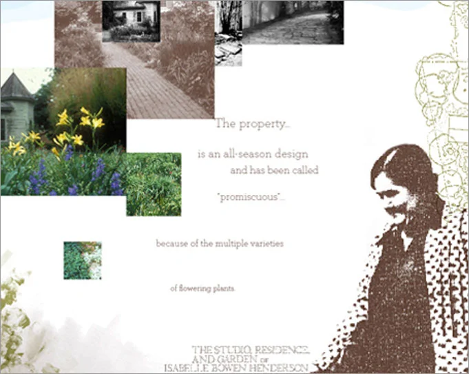
Graduate Program (MGD) Project
See initial stages of the Raleigh Revealed process
Project: Collaborate in a group of four to create a speculative web presence illuminating some aspect of Raleigh, NC; Master’s project at NCSU
Concept: My team focused on Raleigh’s history of gardens and characteristically lush greenery. After mapping and creating a mood board, we decided that we wanted the garden experience to be visually abstract, in order to create a surreal and leisurely user experience.
Process: We chose to pepper the journey with a narrative about a real-life historical figure in the Raleigh gardening community—Isabelle Henderson. This narrative provided a common anchor as the user meandered along the virtual garden path. In the final interactive piece, we explored the user's experience by testing levels of user control and moving between layers of engagement—from a large, macro level, into a midsection “mecro” level, and finally, into the most minuscule micro level. Through exploring these different levels, we investigated how the user’s experience of a virtual garden might be changed, altered, or defined. The final demonstrates one path, with the potential for the user to take several journeys through the garden.
Roles: Process Planning, Illustration, Visual Design, User Experience Design
Collaborative partners: Cady Bean-Smith, Samyul Kim, and Rebecca Tegtmeyer